
If you visited the Kalshi homepage in the last couple weeks, odds are decent you landed on Kalshi’s Midterms Hub. It went live July 22, it’s free, and right now it’s the best looking election dashboard on the internet.
It’s also built by an exchange that would like you to trade.
We’ve had it open most days for the last two weeks. Below is what each piece of it is actually for, why we think this is a pretty big deal, and how we're personally using it.
What Kalshi actually built
It looks like a run at the spot Cook Political Report has held for forty years. And it puts up a pretty good fight.
Why does that matter? Because when Cook moves a race from Lean D to Toss-up, it’s a story in twenty outlets by dinner. That’s the citation layer, the thing newsrooms reach for when they need a number, and nobody has ever held it with market prices instead of reporting. Once you read the hub as a bid for that spot, every design choice on it makes sense.
The Senate number, and the parlay behind it
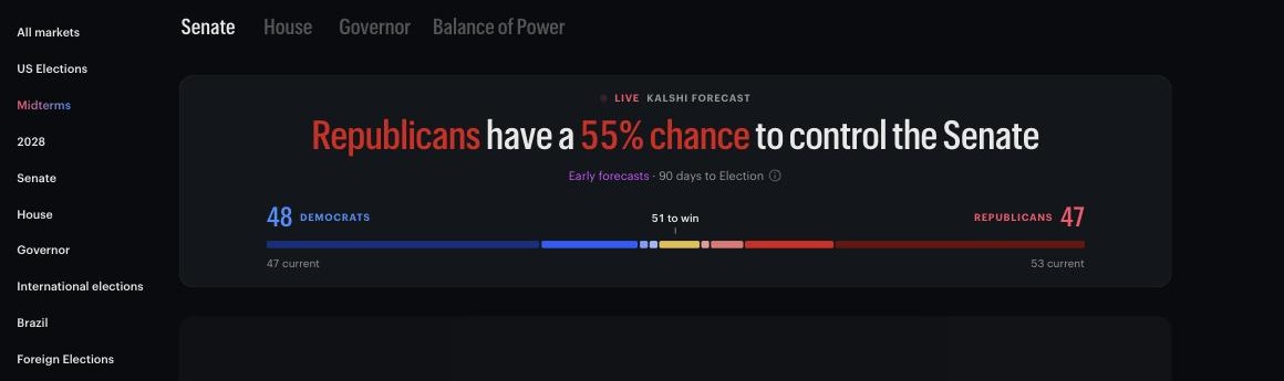
Kalshi Midterms Hub, Senate tab, August 5, 2026.
Open the midterms page and you see a large headline, "Republicans have a 55% chance to control the Senate." That one line is enough to draw millions of visitors to the site, which tracks with the 1-in-5 Americans that "report browsing or viewing prediction market odds strictly to gather information on elections or real-world events without putting money down" (Paradigm Poll).
Below that is the state-by-state analysis, monitoring the key swing states (Alaska 55 D, Michigan 59 D, Ohio 54 D, Iowa 60 R, Texas 54 R) that could tilt the Senate. Democrats are at 48 and need 51. Three of the five already lean their way. Win those three and they’ve got the chamber.
So run the math the way most people would, simply assuming these are independent events. Multiply 0.55 by 0.59 by 0.54 and you get 17.5%. The market says Democratic control is 45%.
Some of that gap is extra paths, since Democrats can drop Ohio and take Iowa instead. Most of it is correlation. A national environment good enough to hold Michigan is the same environment that holds Ohio and puts Iowa in play, so these five move as a group and winning all three is far likelier than three independent coin flips.
Kalshi gives you the data but it is still up to you to figure out the story. Journalists can use it to add context or further shape a story. Prediction market traders can use it to ground their analysis before adding potentially unaccounted for variables. Either use, or one of the other plethora out there, the hub is a highly reliable, data driven home for monitoring this race.
Why the ratings language matters
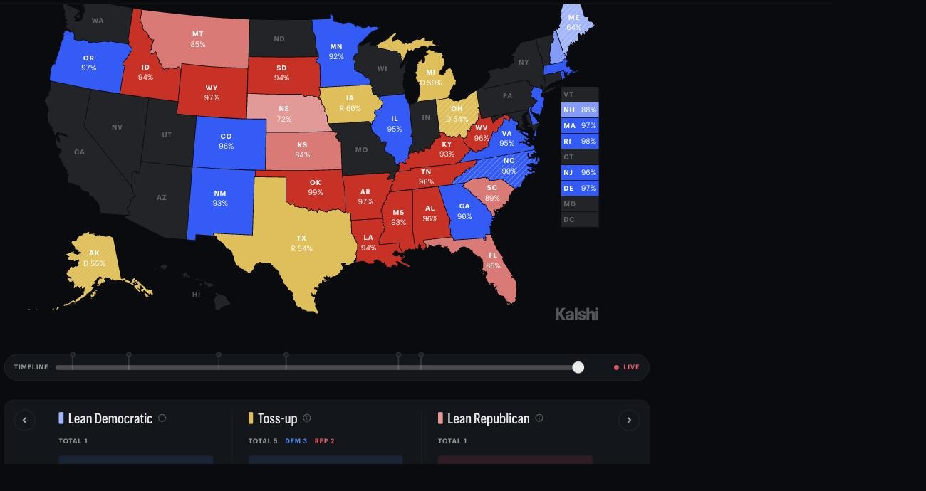
Kalshi Midterms Hub, Senate map with timeline slider and race ratings, August 5, 2026.
Every Senate race gets colored by probability, with three buckets underneath: Lean Democratic, Toss-up, Lean Republican. Maine sits alone in Lean D at 64. Nebraska sits alone in Lean R at 72.
There’s also a rating changes module. In the last 24 hours it flagged Michigan shifting from Lean D to Toss-up at 59%, after Abdul El-Sayed won the Democratic primary on August 4 and set up a matchup with Mike Rogers.
This type of information can explode if picked up by the right news outlets. And when looking through this data, that perspective is important as the primary audience here are the newsrooms with the goal of being quoted in highly topical stories. The pitch to a newsroom writes itself: these ratings update continuously, they’re backed by real money, and they cost nothing.
The timeline slider is the best thing on the page
Why do we care about a slider? Because it’s the only free record of when money actually moved, and that’s the one thing you can test yourself against.
Slide to August 4 and watch Michigan reprice around the primary call. El-Sayed picked up five points, Rogers dropped five, and the move landed after the result came in rather than ahead of it.
This can show you exactly how the market reacted to certain news and events. Politicians can use it to get real-time feedback on campaign speeches or announcements. And traders can use it to validate hypotheses around where the market may be predicting vs where it's simply reacting. This presents a trading opportunity for future expected or scheduled events.
The Balance of Power tab as a catch all
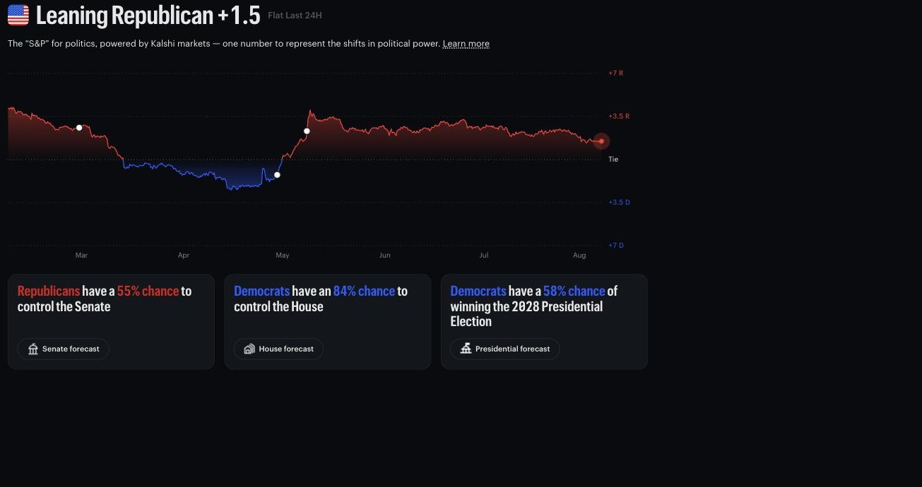
Kalshi Midterms Hub, Balance of Power tab, August 5, 2026.
Quoted as the “S&P” for politics, the Balance of Power view shows both a screenshot and a trending line in where the political momentum is moving. The Senate, House, and Presidential Election all in one spot.
It currently reads Leaning Republican +1.5, with the Senate at 55% R, the House at 84% D and the 2028 presidential at 58% D underneath.
Probably my favorite one-stop page to get a quick download on how things are looking for midterms.
How it stacks up against everything else
FiveThirtyEight and Silver Bulletin. Model output with published methodology, updating on polls. When it’s wrong you can read why.
Cook and Sabato. Reporters, not models. Slow, credible, accountable, no probability attached.
RealClearPolitics. Polling averages. No probability, and no record of what people expected last month.
Action Network’s midterm tracker. Markets against polls, built as a comparison rather than a reference.
Polymarket’s election pages. Better market structure, worse presentation, nothing close to this map.
Kalshi’s hub is the only free thing that puts a probability, a price history, a state map and race-level context in one view. That’s why it’ll get cited, and it’s a real gap nobody else went after.
What a market gives you that a model can’t: the price somebody was actually willing to pay. A model at 55% is an opinion. A market at 55% is where a trade cleared, which tells you how much money stands behind the view.
What a model gives you that a market can’t: a reason. When 538 misses you can read the methodology and find the bad assumption. When a thin Kalshi market misses there’s nothing to read.
How to actually use it
Your first research stop for midterms. The snapshot is helpful but the trends are more important. Use your AI to overlay the odds movements with major events. Leverage that analysis to predict how markets will shift with future events.
I am not using this page to tell me what trade to make. But I am using it similarly to how I may be checking Vegas odds before entering a daily fantasy sports lineup. It's helpful, it's telling, but it's just the first step into further research.
Where we come down
So you’ve got the cleanest election dashboard anyone has shipped, built in the vocabulary newsrooms already use, backed by real money instead of reporting, updated continuously, and handed out free during the exact cycle when the argument over whether event contracts serve a public purpose is still sitting in front of the CFTC. It works. It's a pretty impressive job by Kalshi and likely to be quoted heavily over the next few months.
If you're looking to trade, use it for the first ninety seconds. Then do your real work where you dive deeper than this public data. Figure out what's most predictive and what's noise. What blindspots exist and what can you see that others aren't. That's what we're trying to figure out at PredictQ and if you want to join the conversation, we'll be in the PredictQ Discord.